C Bright Sound
Brand Strategy . Product Design
Shuttle
Case Study

App: Shuttle: Food Delivery Korea
Client / Brand: Shuttle Co., Ltd.
Service: A food delivery (and grocery & essentials) mobile application tailored for non-Korean speakers
in South Korea.
Goal: Create a user-friendly, multilingual delivery app that removes typical barriers for foreigners (language, payment, local phone number, unfamiliar address systems) so they can seamlessly enjoy Korea’s delivery culture.

SHUTTLE
APPROACH
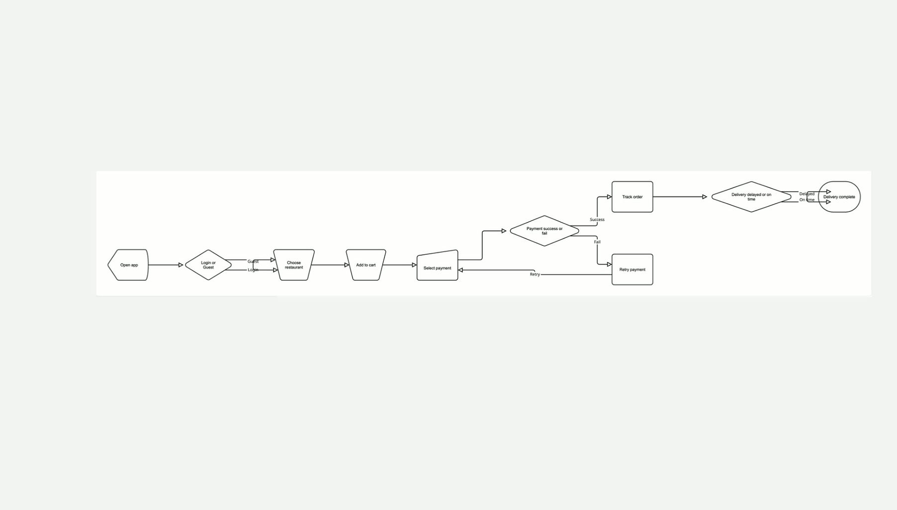
We began by mapping real user pain points: language, signup, payments, and confusing address inputs
The solution focused on clarity, inclusivity, and familiarity, designing a smooth journey from onboarding to delivery tracking, with an interface that feels friendly and global.
Partnered with local restaurants known to serve foreigner-friendly menu items, and flagged them in app.
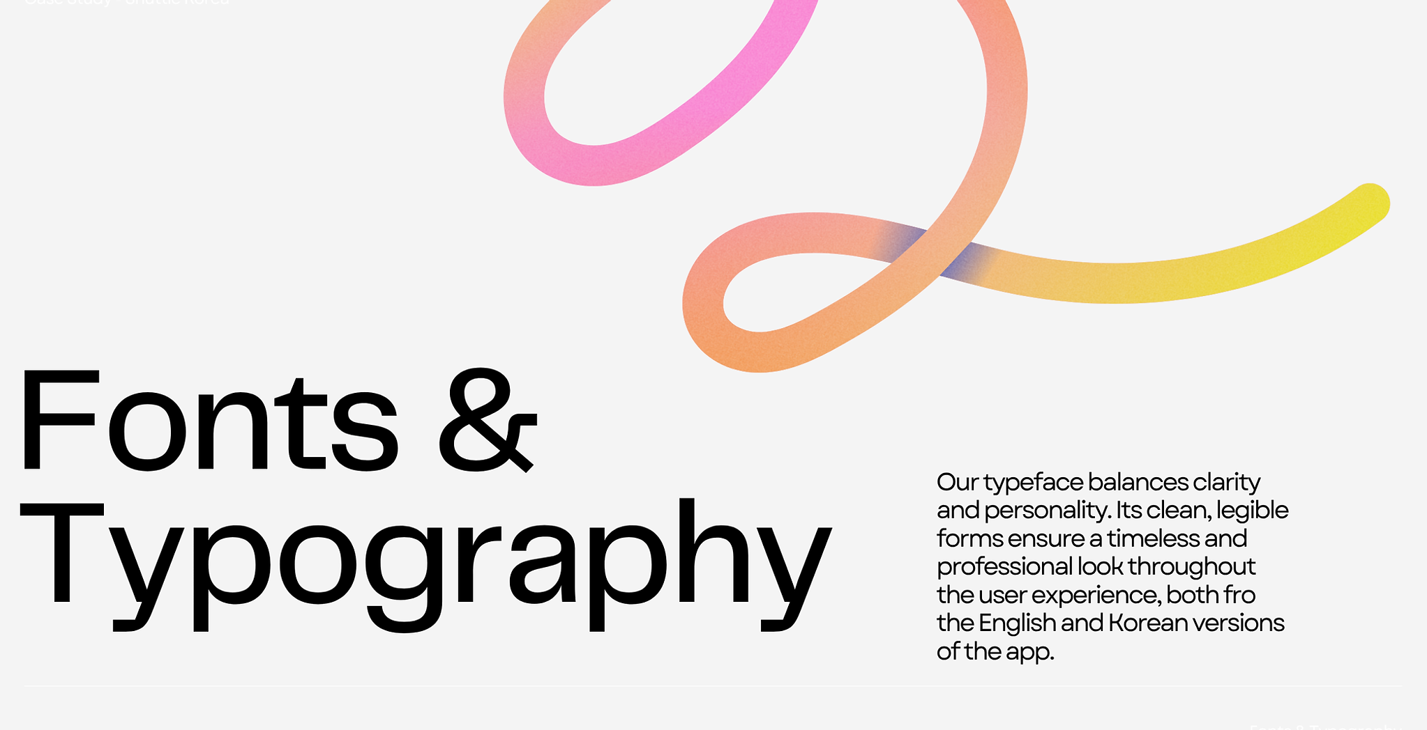
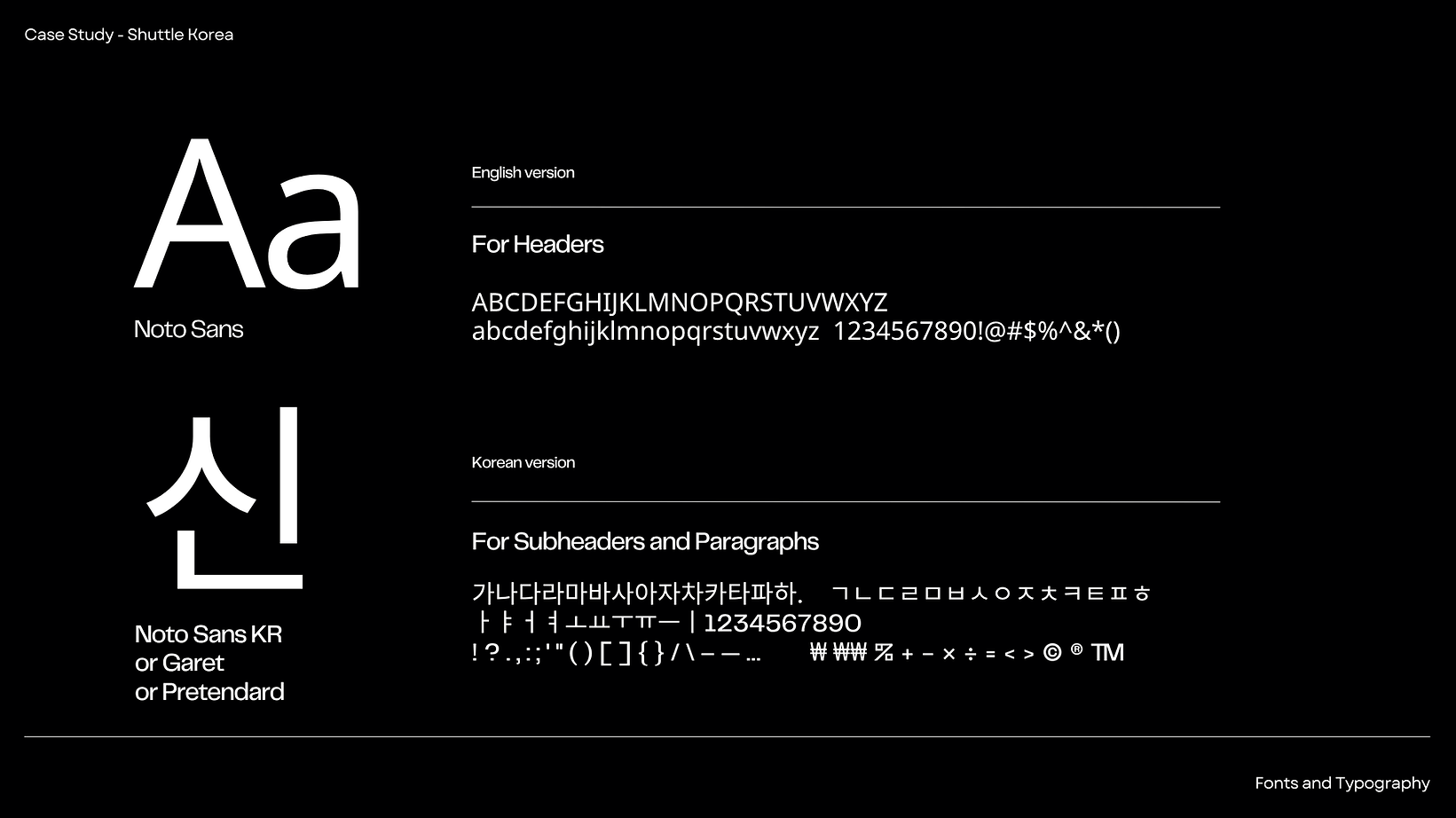
Find Korean typography and design the app fro English and Korean speakers.
Project scope: I led the creation of Shuttle’s first mobile app and complete brand identity redesign, including both English and full Korean versions of the visual system.
The work covered UX/UI architecture, logo evolution, and design language, with a focus on optimizing the onboarding, payment, and delivery-tracking experience to make Korea’s delivery culture accessible to everyone.
Tools: Figma, Illustrator, Uizard.io, Notion, Zeplin, Slack


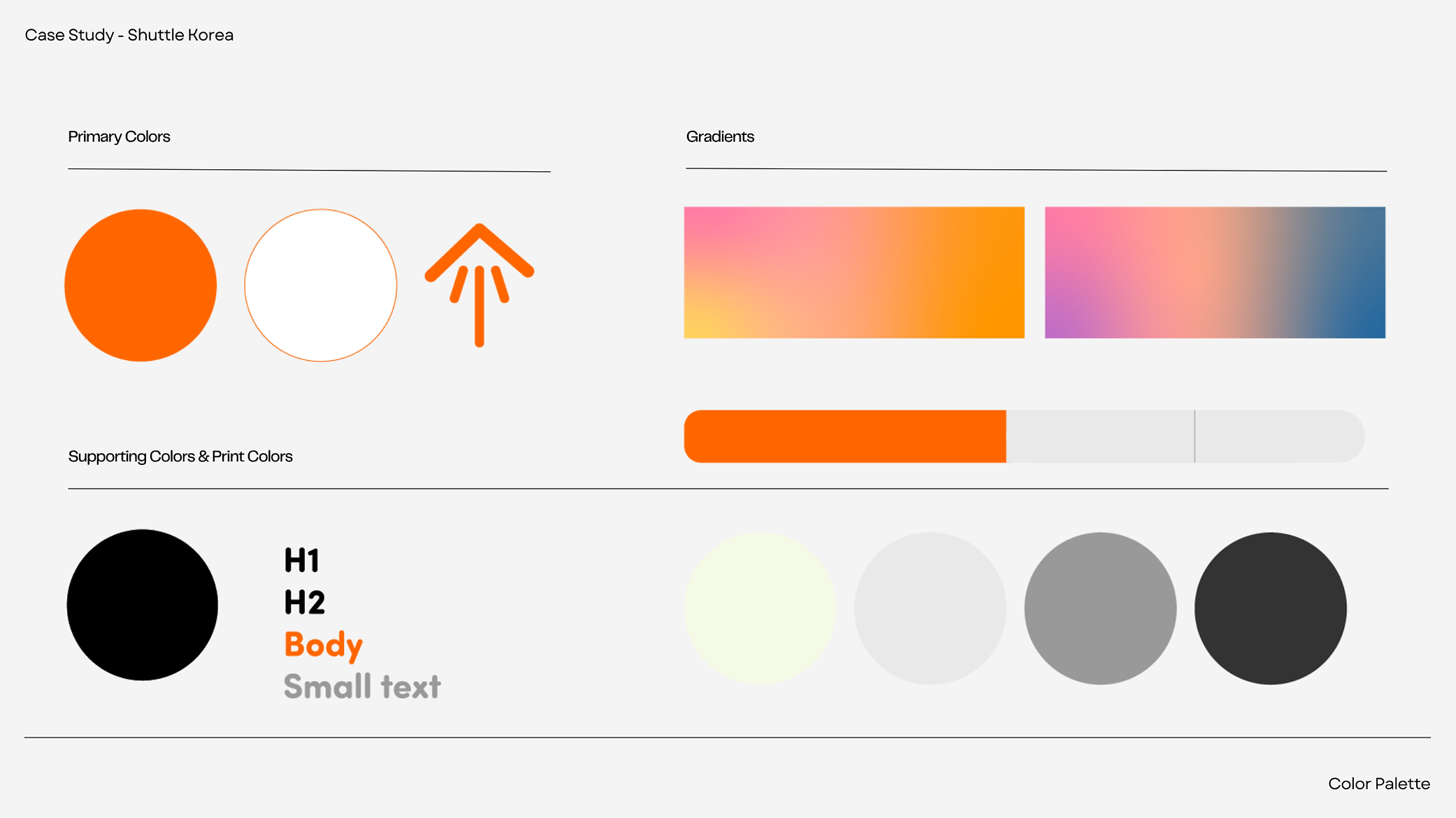
Brand
& Visual Language
The brand visually positions Shuttle as accessible, global, friendly, and Korean-local culture infused.
The UI uses clean iconography, globally recognizable symbols for payment/delivery, and friendly tone in on-boarding copy.